
Campfire Circle
Brand Identity Design
Agency | Ramp Communications
Services | Logo Design, Brand Identity System,
Press | RGD Featured Project,
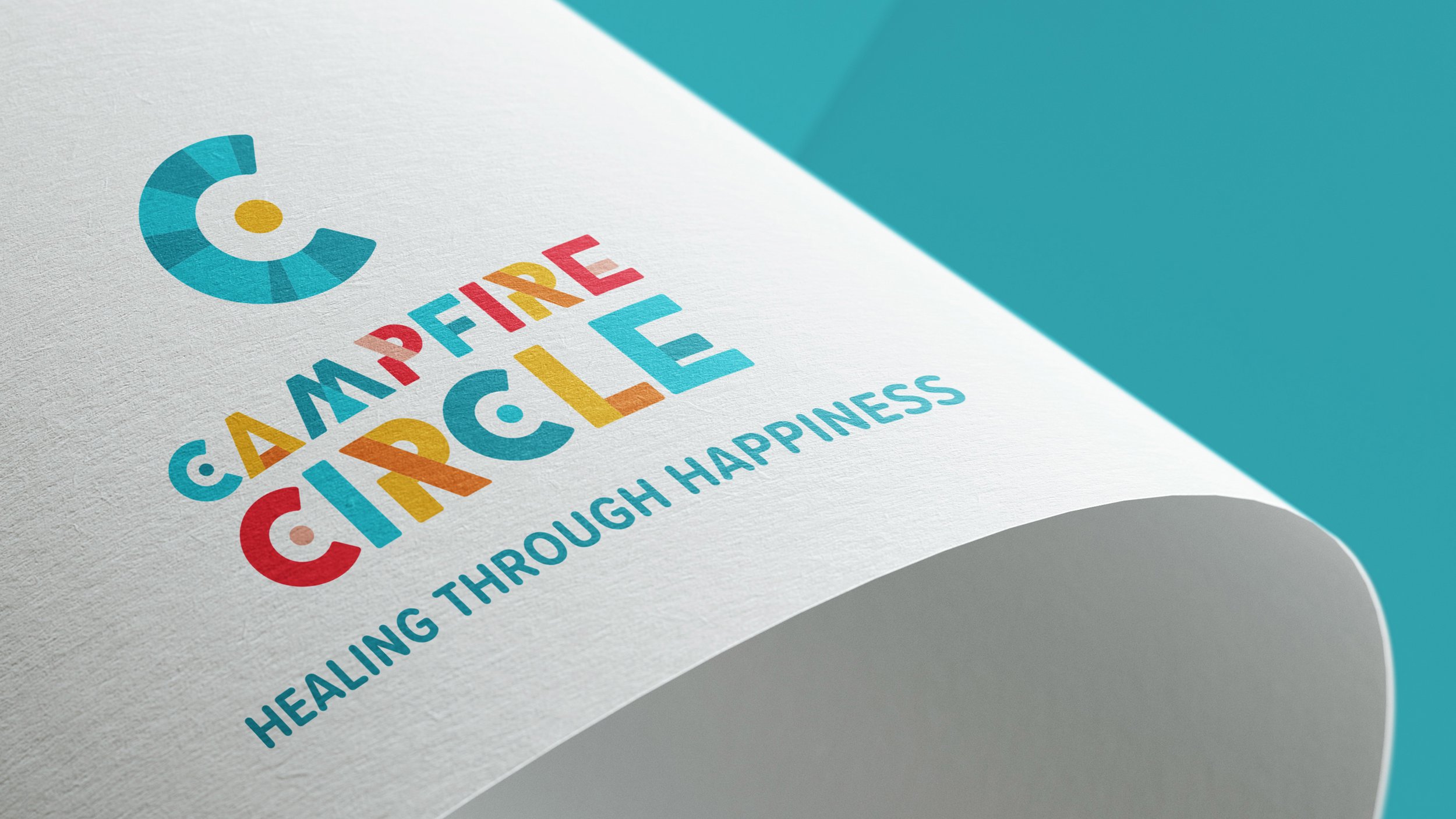
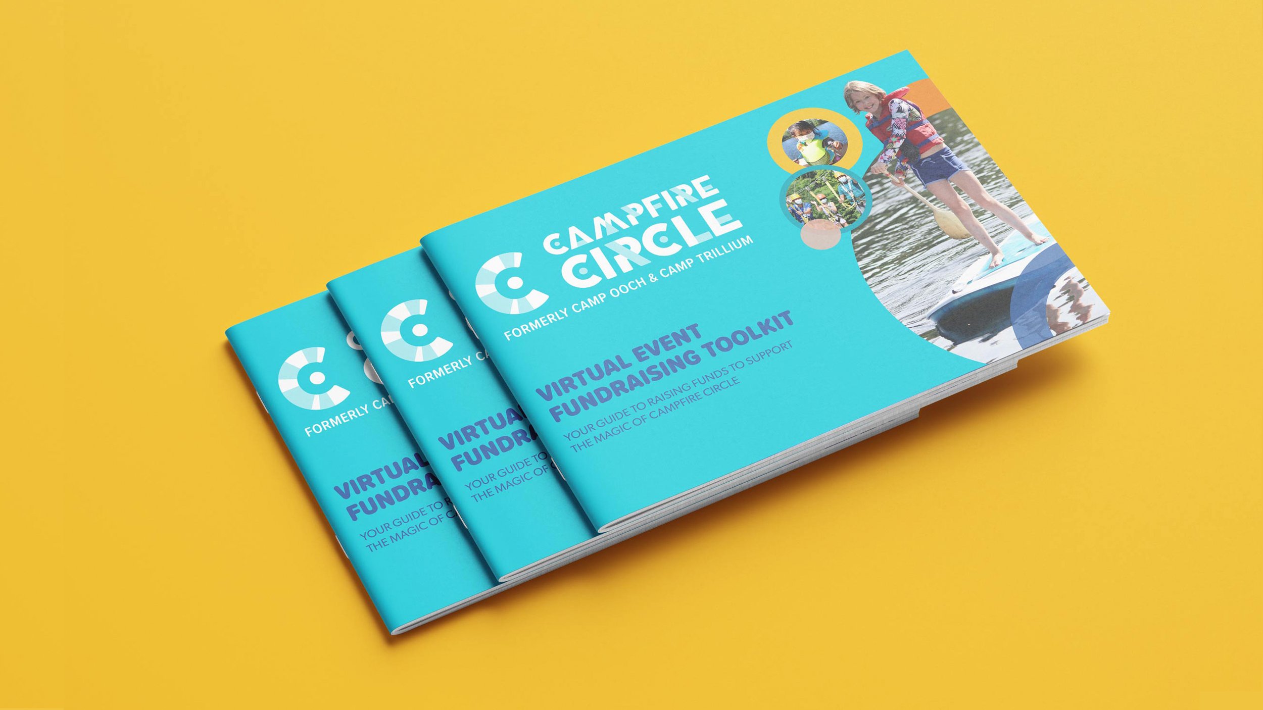
With a combined history of over 70 years, Camp Ooch and Camp Trillium, merged in 2020. These two well established charities shared an overlapping purpose and commitment to normalising the cancer journey for kids and families. Our challenge was to seamlessly bring together these two organisations with a new name and one unique brand, while maintaining the emotional equity each had spent years building.
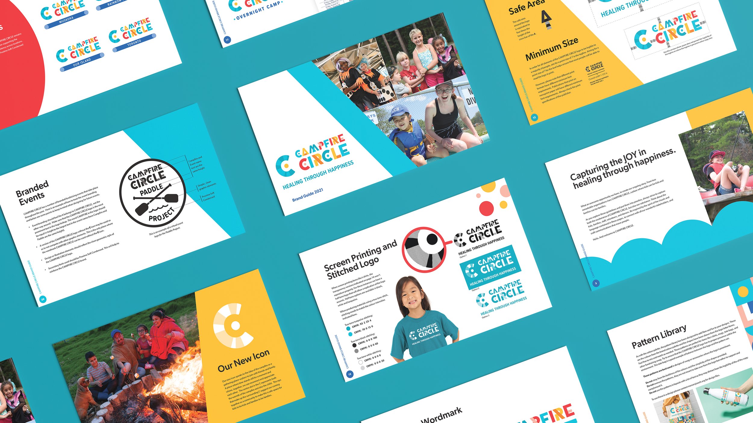
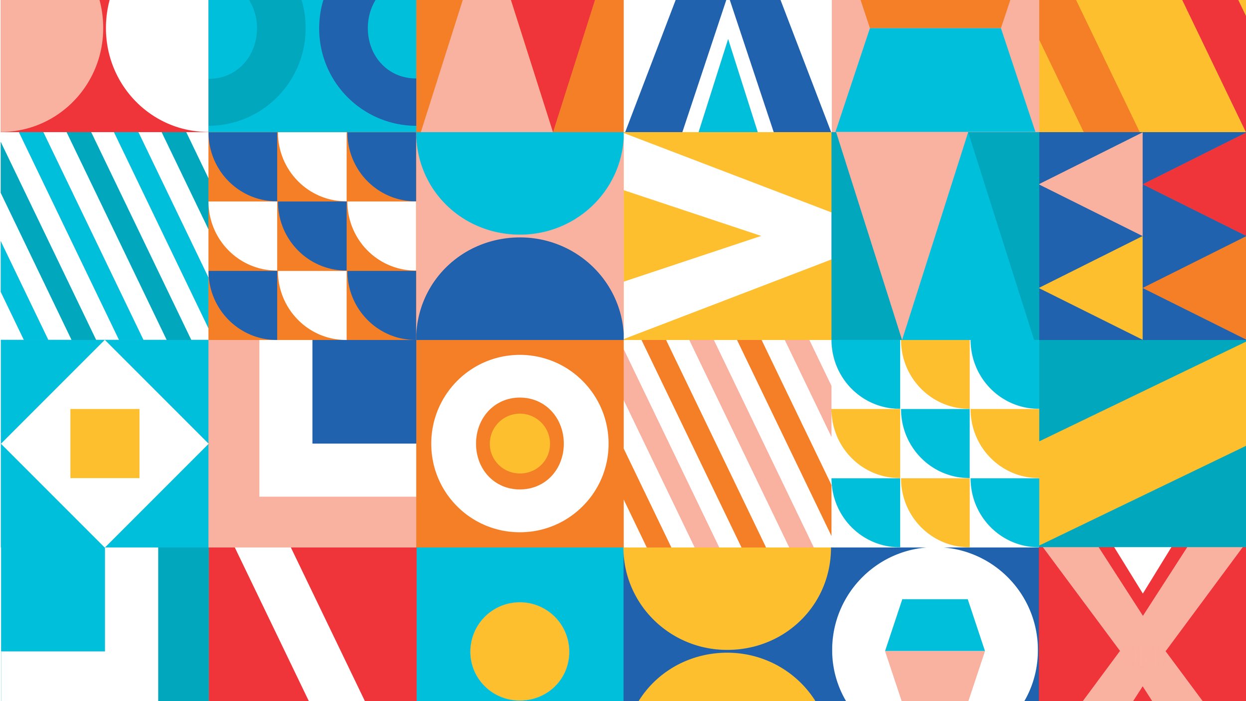
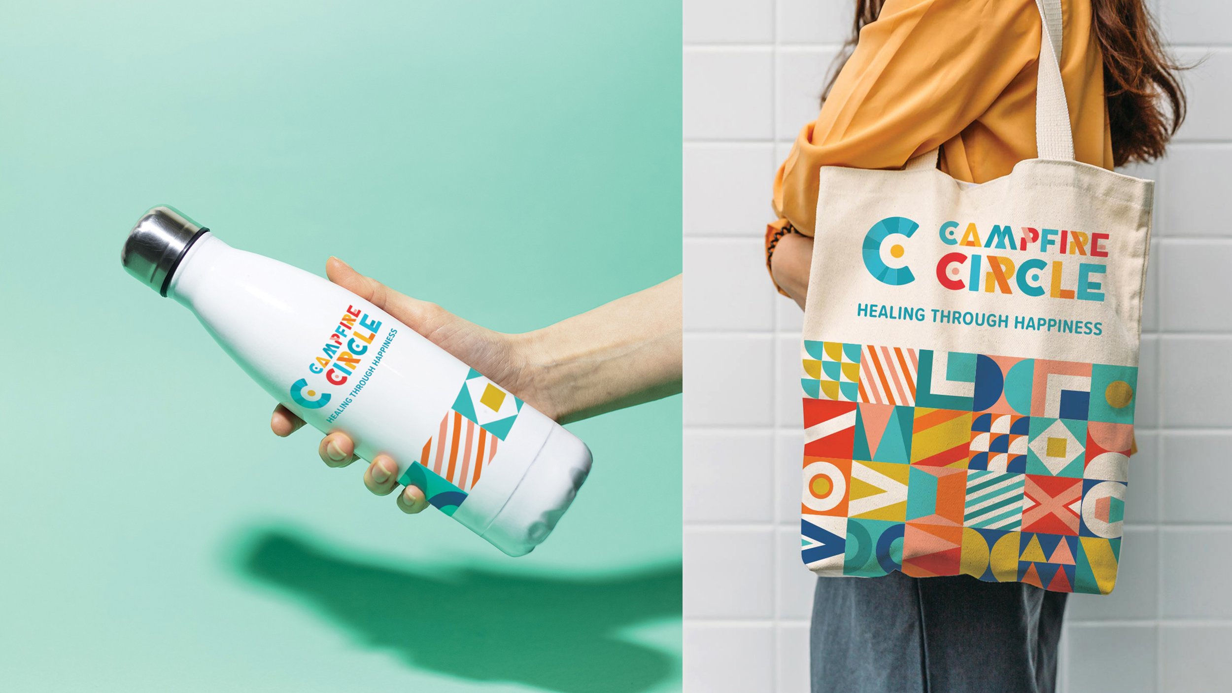
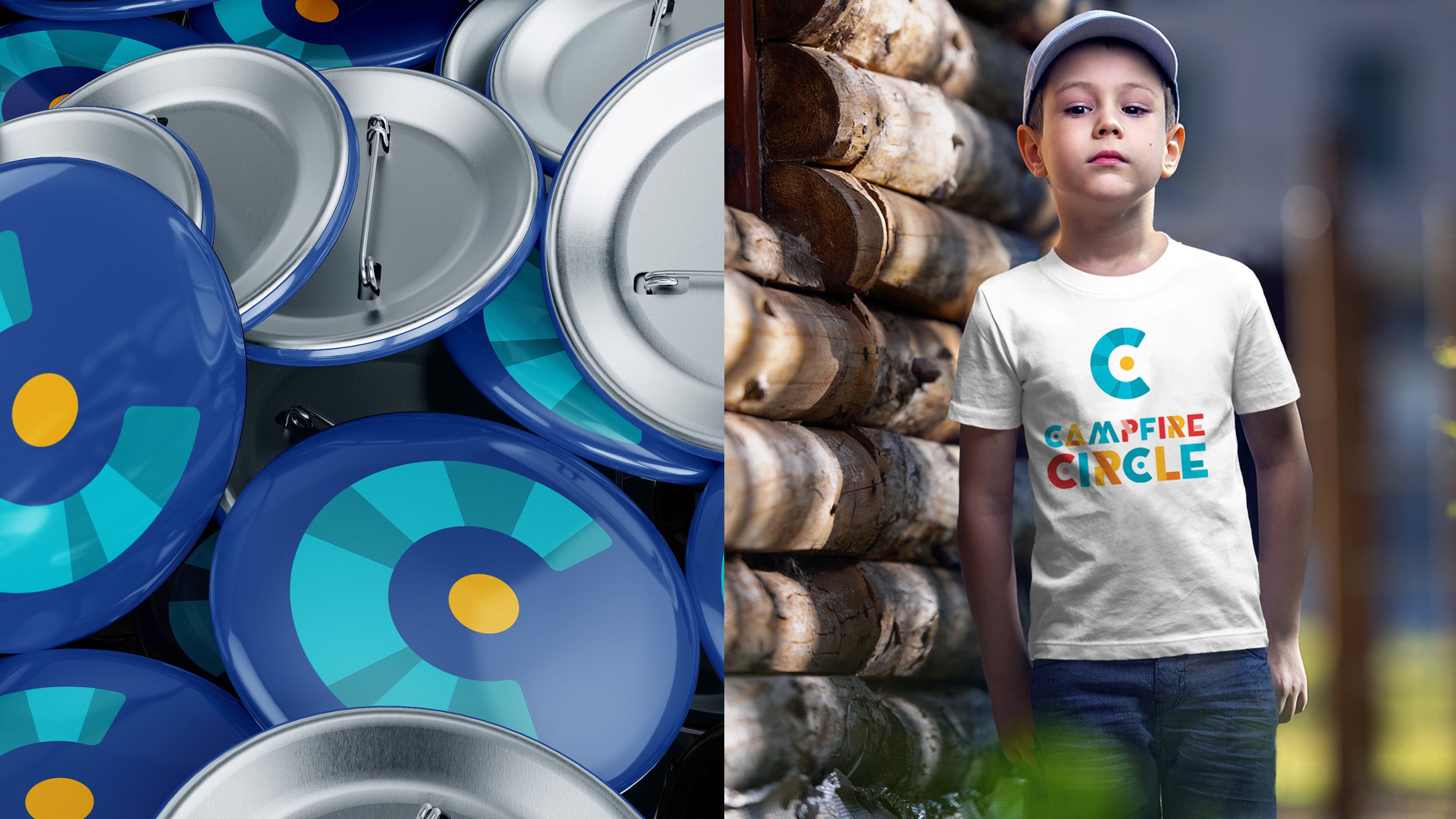
My design solution for this logo and identity is a contemporary reflection of camp. Its vibrant nature-inspired colours symbolise the joy of healing through happiness. Taken as a whole the wordmark reflects both a time and a place where life can feel normal and full of joy. The icon speaks to the idea of the campfire as a gathering place-a place to join with friends and family. I also created a pattern library to enable the brand to easily build upon the look established.